
[Note] Ridgeline Plots in R (ggridges)
Published:
Ridgeline plots are a clean way to compare distributions of a continuous variable across multiple groups. This note introduces the ggridges package and shows practical options for shaping, spacing, and coloring ridgelines in ggplot2.
Ridgeline plots (also called joy plots) visualize multiple density curves stacked along a categorical axis. They are especially useful when you want to compare how distributions shift or differ across groups (e.g., treatments, sites, time points).
In ggridges, two commonly used geoms are:
geom_density_ridges()(open ridges)geom_density_ridges2()(closed ridges)
Package setup
# install.packages("ggridges")
library(ggridges)

# install.packages("ggplot2")
library(ggplot2)
We use a small example dataset from diamonds:
df <- diamonds[1:100, c("color", "depth")]
1) Basic ridgeline plots
geom_density_ridges()
ggplot(df, aes(x = depth, y = color)) +
  geom_density_ridges()
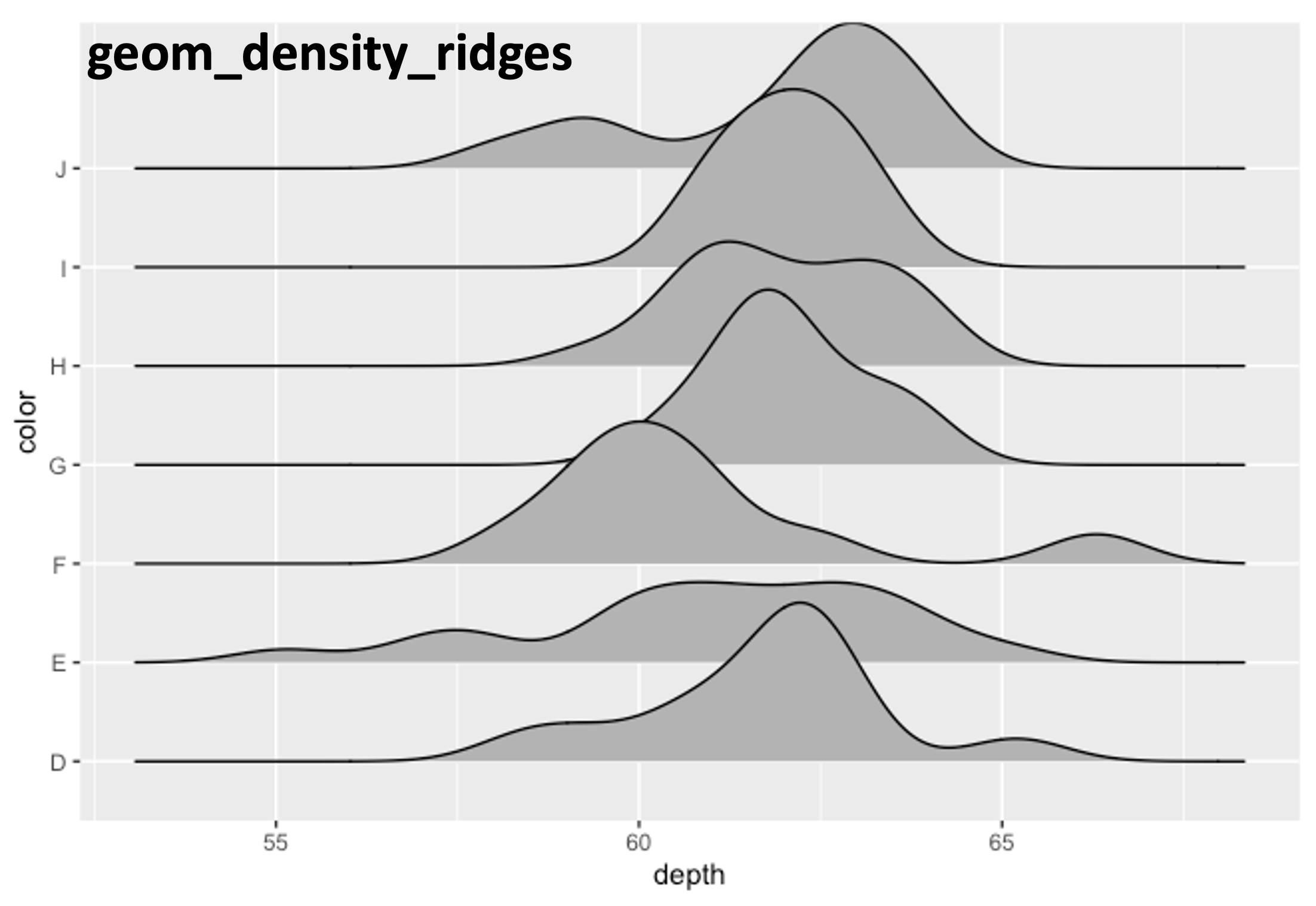
Figure 1. Ridgeline plot created using geom_density_ridges().
geom_density_ridges2()
geom_density_ridges2() produces a similar plot but with closed ridges.
ggplot(df, aes(x = depth, y = color)) +
  geom_density_ridges2()
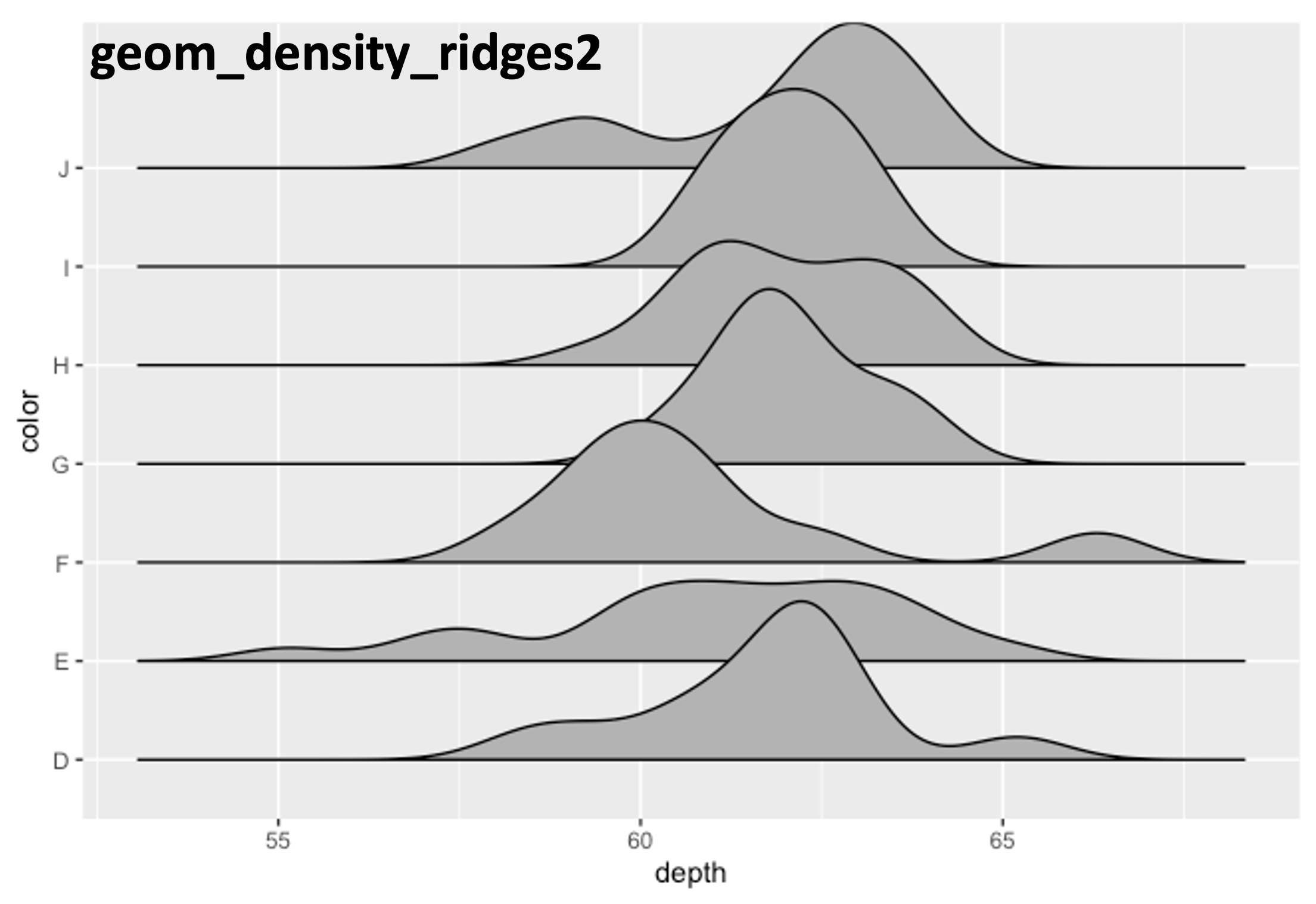
Figure 2. Ridgeline plot created using geom_density_ridges2().
2) Key parameters
Tail trimming: rel_min_height
rel_min_height controls how much of the density tail is removed. Smaller values keep more of the tail; larger values trim more aggressively.
ggplot(df, aes(x = depth, y = color)) +
  geom_density_ridges(rel_min_height = 0.005)
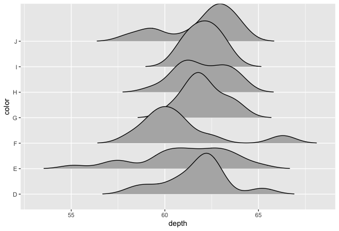
Figure 3. Low trimming (more tails kept).
ggplot(df, aes(x = depth, y = color)) +
  geom_density_ridges(rel_min_height = 0.5)
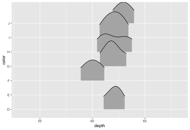
Figure 4. Strong trimming (tails cut earlier).
Ridge spacing: scale
scale controls how much the ridges overlap/stack. Smaller values are more compact; larger values spread ridges vertically.
ggplot(df, aes(x = depth, y = color)) +
  geom_density_ridges(scale = 1)
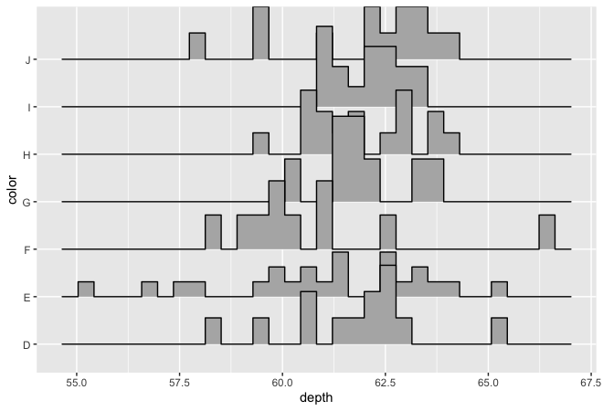
Figure 5. Compact ridge spacing.
ggplot(df, aes(x = depth, y = color)) +
  geom_density_ridges(scale = 10)
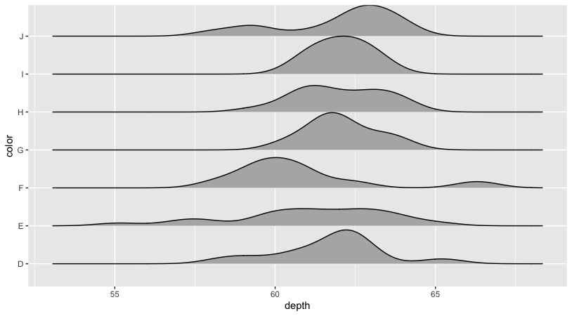
Figure 6. Expanded ridge spacing.
Alternative statistic: stat = “binline”
You can switch the statistic used for the ridge geometry.
ggplot(df, aes(x = depth, y = color)) +
  geom_density_ridges(stat = "binline")
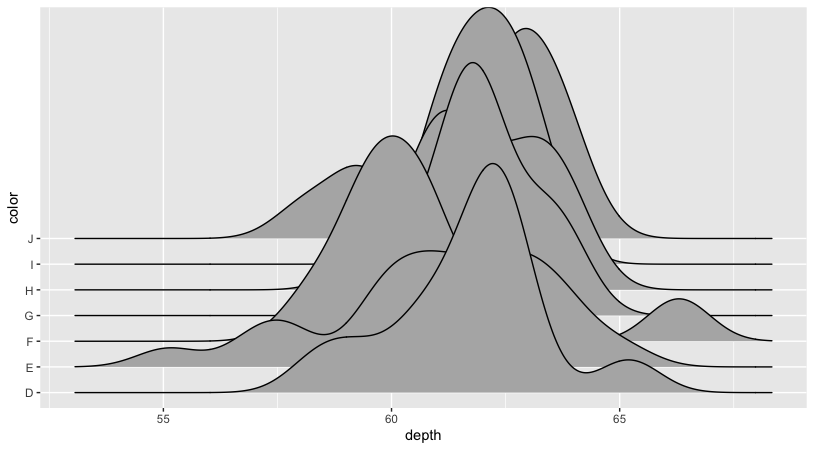
Figure 7. Ridgeline plot using stat = "binline".
3) Styling and colors
Single fill color and transparency
ggplot(df, aes(x = depth, y = color)) +
  geom_density_ridges(fill = "lightblue", alpha = 0.5)
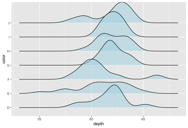
Figure 8. Uniform fill color with transparency.
Line style (color, linetype, linewidth)
ggplot(df, aes(x = depth, y = color)) +
  geom_density_ridges(fill = "white",
                      color = 4,
                      linetype = 2,
                      lwd = 1.5)
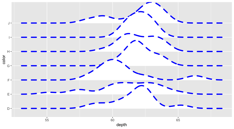
Figure 9. Customized ridge outline style.
Fill by category
Map fill to the category variable to color each ridge group.
ggplot(df, aes(x = depth, y = color, fill = color)) +
  geom_density_ridges()
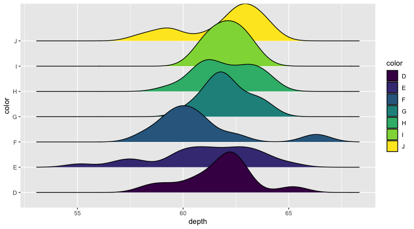
Figure 10. Fill mapped to category (color).
To set exact colors, use scale_fill_manual():
ggplot(df, aes(x = depth, y = color, fill = color)) +
  geom_density_ridges() +
  scale_fill_manual(values = c("red","orange","yellow","green","cyan","blue","purple"))
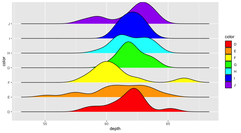
Figure 11. Manual fill palette using scale_fill_manual().
Gradient fill along the x-axis
Use a gradient fill mapped to the x-value:
ggplot(df, aes(x = depth, y = color, fill = stat(x))) +
  geom_density_ridges_gradient() +
  scale_fill_viridis_c(name = "Depth", option = "C")
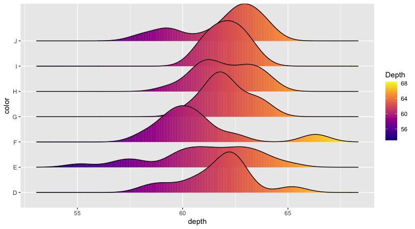
Figure 12. Gradient fill using geom_density_ridges_gradient().
Quantile-based coloring
You can color ridge segments by quantile ranges using stat_density_ridges() with ECDF.
ggplot(df, aes(x = depth, y = color, fill = stat(quantile))) +
  stat_density_ridges(quantile_lines = FALSE,
                      calc_ecdf = TRUE,
                      geom = "density_ridges_gradient") +
  scale_fill_brewer(name = "")
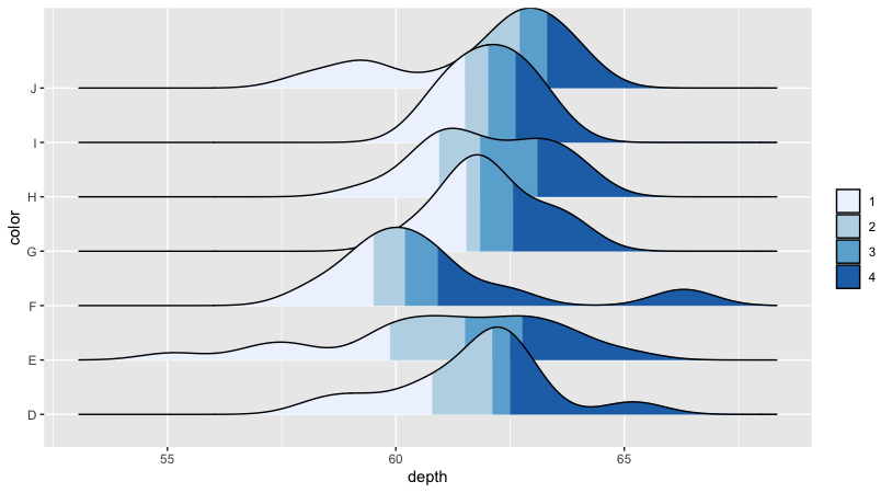
Figure 13. Quantile-based fill using ECDF.
Highlight distribution tails
This approach can highlight tails by choosing quantiles (e.g., 5% and 95%) and assigning different colors.
ggplot(df, aes(x = depth, y = color, fill = stat(quantile))) +
  stat_density_ridges(quantile_lines = TRUE,
                      calc_ecdf = TRUE,
                      geom = "density_ridges_gradient",
                      quantiles = c(0.05, 0.95)) +
  scale_fill_manual(name = "Prob.",
                    values = c("#E2FFF2", "white", "#B0E0E6"),
                    labels = c("(0, 5%]", "(5%, 95%]", "(95%, 1]"))
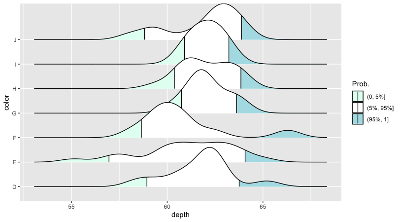
Figure 14. Tail highlighting using selected quantiles.
Notes
- For very small sample sizes, density shapes can be unstable; use more data if possible.
- If ridges overlap too much, reduce
scaleor increase the y-axis spacing (or use fewer groups). - When using gradient or quantiles, keep legends simple so the plot stays readable.
Further reading
END